
戈 OG DUMPLING HOUSE KIOSK 次
Navigating and customizing a 55 Item Menu

THE PROBLEM
OG Dumpling House is a local Chinese restaurant in Rochester, NY that has an expansive menu with 8 different categories and subcategories that makes it a challenge when ordering off the physical menu or over the phone
THE SOLUTION
A self serve kiosk that organizes the vast menu into a visual experience that eliminates the confusing between staff and consumer, as well as filter out items based off of user allergens for a less intensive product searching experience
ESTABLISHING A USER FLOW
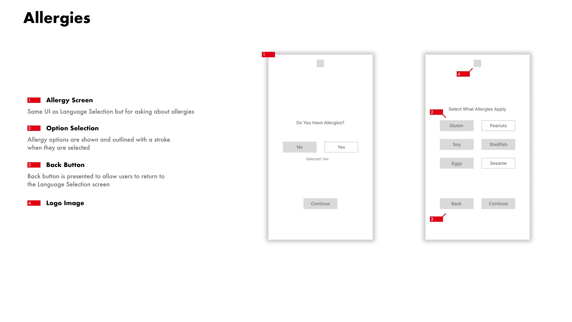
Before tackling the visual design, every user interaction, decision and visual feedback needed to be established for an effective experience. The first portion of the experience is the landing page and onboarding portion where the user can select their language followed by selecting their allergens which will eliminate the items with those selections in them.
The Navigation portion provides all of the categories on the left for easy switching between sections of the menu and will provide information on selections such as descriptions, substitutions that can be made, and adjustment of the quantity
Lastly, is the checkout portion of the flow which follows standard checkout procedure and produces a receipt with the table number to sit at to be served


WIREFRAMING
Once all the user flow was all figured out and developed, I created wireframes according to the user flow charts and I started developing the organization of visual UI elements. Specific annotations indicated what each element was and exemplified why it was there
The portion that took the longest to develop was the main menu navigation portion as it had to accommodate all items on the menu, clearly separating each of the 8 categories and sorted each item within a sub category labeled inside the main category


DEVELOPING STYLE
Now that all the wireframes were complete, I worked on creating the style. This included selecting color schemes, typefaces, and specific UI assets as well as determining the size and spacing of UI elements to best accomodate the numerous product cards
The overall style stayed mostly true to the original brand colors of red black and white which carried over into the style of the UI elements, creating a system of contrast that clearly communicates with the user of the status and function of various elements


Final Screens


MY REFLECTION
This project really strengthened my understanding of design system level thinking and approaching the design beyond the visual component and rather thinking about the importance of establishing user flows product accessibility.
OG Dumpling House is a very well respected restaurant in Rochester, New York that has a large menu with a vast number of items which can create a level of confusion between staff and consumer that is further exemplified when it is highly trafficked, creating a frustrating experience for both the customer and employee. I created this kiosk to solve these issues and provide a more streamlined and concise experience for both sides of the counter.